
On average, readers only spend around 8.2 seconds on a website (source: Nielsen Norman Group). The trick: minimalism. A neutral base of white, cream or grey tones, clear contrasts and a deliberately chosen accent color create calm and focus. If, on the other hand, the page is overloaded, the dwell time decreases even faster – content is visually lost.
You can find out more about this topic in the article Website colors 2025 – complete overview, with trends, examples and the effect of modern color schemes.
How to implement minimalism in web design – step by step
Minimalist design thrives on clarity. With the 60/30/10 rule, you use 60% main color, 30% secondary color and 10% accent color. This division provides structure, recognition and visual balance – without overwhelming the eye.
-
1. define your base color
Choose a calm base color for the background and large areas. White, off-white or a light gray create openness and lightness. A light base also provides sufficient contrast to text and accents – the eye can follow better.
-
2. add a secondary color
This serves as a structural element for sections, cards or info boxes. It visually separates content without dominating it. Pastel shades or muted earthy colors lend depth to the layout and look harmonious on all devices.
-
3. deliberately choose an accent color
A stronger color sets specific highlights on buttons, links or icons. It draws the eye exactly to where you want attention. Use the accent color sparingly so as not to dilute the effect – less really is more here.
-
4. check your contrasts
For good legibility, the text should have a sufficient difference in brightness to the background. The AA and AAA contrast values of the WCAG guidelines specify how strong the difference must be. AA is the minimum standard, AAA stands for optimum accessibility. Use tools such as the WebAIM Contrast Checker to check your color scheme directly.
Why neutral pallets are convincing
Neutral color schemes look modern, professional and long-lasting. They draw the focus to the content, typography and photos – instead of the background. Especially for brands with a clear message, this creates trust and calm in the design. Minimalism is not renunciation, but conscious choice – and therefore one of the strongest trends for 2025.
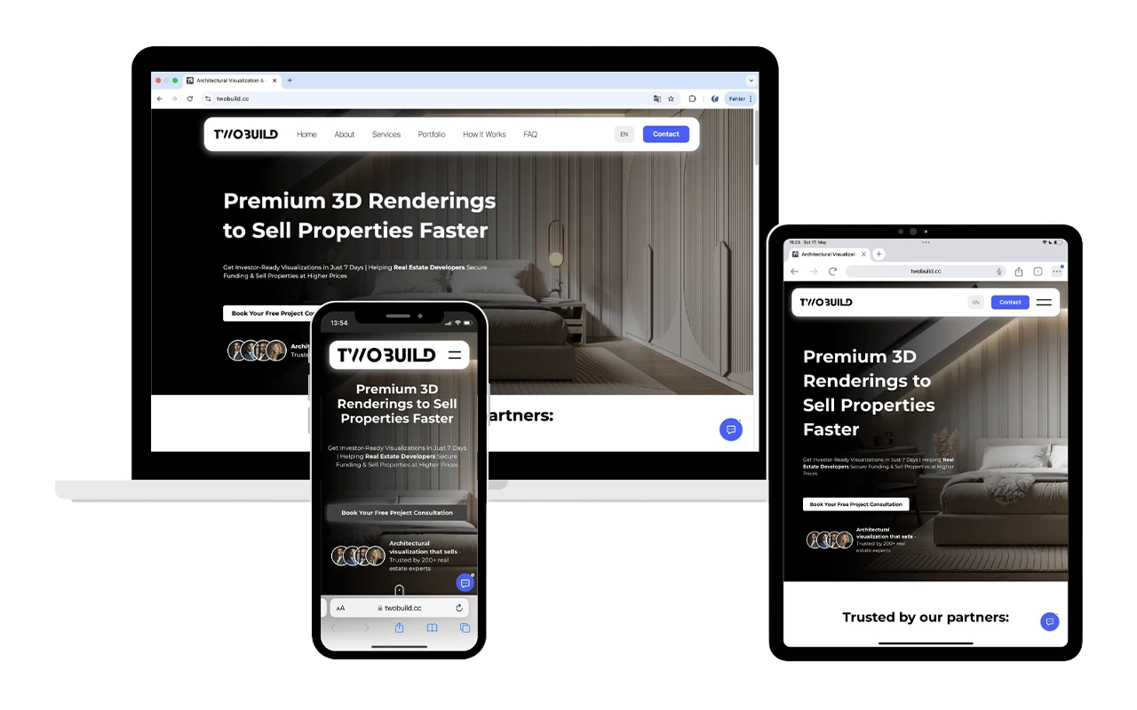
Example of a minimalist website: TwoBuild.cc – clear structures, neutral colors, subtle typography.
Conclusion: Clarity instead of overload
A minimalist color concept ensures clarity, calm and professionalism. Less color means more impact – clear surfaces, targeted contrasts and deliberate accents make your website timeless and user-friendly.
FAQ: Minimalism & website colors explained
Which colors are best suited for minimalist web design?
Light basic tones (white, beige, light grey) combined with an accent color, such as navy blue, petrol or terracotta. This keeps the design calm but with a strong character.
How exactly does the 60/30/10 rule work?
60 % main color for large areas, 30 % secondary color for structure and 10 % accent color for buttons, links and highlights. This simple formula ensures harmony and recognition.
What is the difference between AA and AAA contrast?
AA stands for the minimum standard of legibility (e.g. 4.5 : 1), AAA for very high legibility (7 : 1). The higher the value, the better text can be recognized on any surface.
Can minimalist design also be colorful?
Yes – as long as you use colors purposefully. A neutral base and a few bold accents often have a stronger effect than many different tones.