
Responsive web design means that your website automatically adapts to cell phones, tablets and laptops. Text, images and buttons remain legible and clickable – no matter what device your visitors are using.
As screens vary greatly in size, a modern website needs a layout that changes flexibly and doesn’t just look good on a laptop.
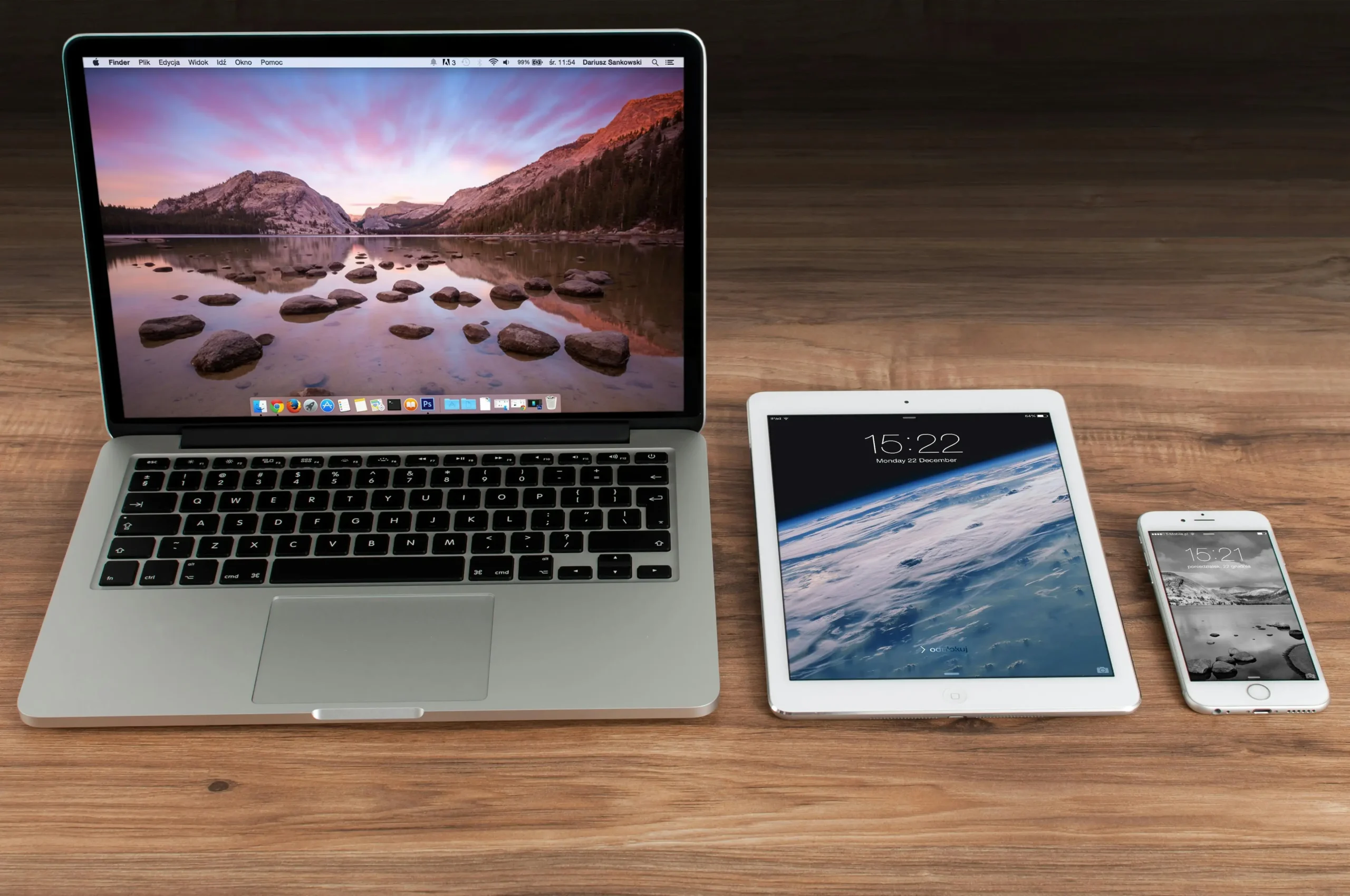
As you can see in the image: Your website must work on laptops, tablets and smartphones – with a layout that adapts automatically.
Why responsive design is so important
In many industries, more access is now coming from cell phones than from desktops. Particularly affected are:
- Service providers such as hairdressers, doctors, craftsmen, coaches
- Restaurants, cafés, bars and hotels
- Online stores and booking platforms
- Local businesses that can be found via Google Maps or social media
Depending on the industry, around 60% of all website visits today are made via smartphone (source: Statcounter, Similarweb). This makes mobile design a must.
Fewer people surf on a tablet than on a cell phone, but a completely broken tablet view quickly looks unprofessional. Clean spacing, easy-to-read fonts and functioning navigation should therefore be ensured on all devices.
Tips for good responsive web design
With a few basic rules, you can optimize your website much better for cell phones and tablets:
- Shorter texts: Split up long blocks or hide them with an accordion.
- Clear header: Working with the burger menu on your cell phone.
- Sufficient spacing: finger-friendly click surfaces.
- At least 16 px font size: Mandatory on cell phones.
- No hover effects: Cell phone has no mouse pointer.
- Optimize images: Sharp, but small enough for fast loading times.
- Simplify forms: Fewer fields, larger buttons.
Is my website responsive in the modular system or in WordPress?
In website builders such as Elementor, you can switch directly between desktop, tablet and mobile view. This allows you to see how everything feels as you build it.
The video shows you how to switch cleanly between laptop, tablet and mobile view in Elementor.
This allows you to customize per device:
- Font sizes & spacing per device
- Display elements only on mobile or only on desktop
- Move columns one below the other
Is my website responsive in the browser?
You can easily test this in Chrome:
- Open website
- Right-click → Examine / Inspect
- Select device icon at top left
- Click through different sizes
The video shows how you can test different devices in Chrome.
Optionally, you can also simply make the browser window smaller – if everything fits neatly, this is a good sign.
Responsive layout, typography and content
Responsive layout
Columns are automatically rearranged – e.g. one below the other on a cell phone instead of next to each other.
Responsive typography
Headings on cell phones smaller, body text at least 16 px.
Optimize texts for cell phones
- short heels
- Lists instead of long continuous texts
- FAQ elements
Responsive images: Sharp & fast
Images must be sharp but load quickly. The right ratio is crucial.
| Image dimensions | Screen area | Effect |
|---|---|---|
| small screen | large screen | fast, but pixelated |
| very large picture | Small screen | Sharp, but slow → poor performance |
| large optimized picture | large screen | sharp & performant |
| multiple screen sizes | all screen sizes | Browser automatically loads the best variant → optimal |
As shown in the table: several image sizes are ideal.
Conclusion: Responsive design is mandatory
Most visitors come via smartphone – an unadapted website costs inquiries.
- Better user experience
- better Google visibility
- professional impression
- more inquiries & customers
Frequently asked questions about responsive web design
What does responsive design mean?
The layout of your website automatically adapts to different screen sizes.Do I need a mobile version?
No – modern websites work as one version for all devices.Is my website responsive?
If you have to zoom in on your cell phone or texts are too small, not so much.Is it possible to make a website responsive at a later date?
Yes – often with a new theme, layout or relaunch.