5 modern alternatives to red (#FF0000) [2025]

Porträt von Tobias Berger, junger Mann mit lockigen Haaren und blauem BSC-Pulli, lächelnd in die Kamera blickend.

by Tobias Berger / updated 24.11.2025 / 4 min. reading time

Porträt von Tobias Berger, junger Mann mit lockigen Haaren und blauem BSC-Pulli, lächelnd in die Kamera blickend.

by Tobias Berger / updated 24.11.2025 /
4 min. reading time

Pure red (#FF0000) quickly comes across as aggressive, old-fashioned or “alarm”. Especially in modern web design, many brands rely on softer, more differentiated tones that still attract attention – without shouting. In this article, we present five modern alternatives to red: #FF6B6B, #E76F51, #F97316, #DB2777 and #7C3AED. You’ll find out how these colors work, what they’re suitable for and which shades are ideal for combining them with. If you want to know how to plan a complete color scheme for your website in general, take a look at our comprehensive guide later on “Color scheme guide: Colors for your website 2025”.

#FF6B6B – Coral Red for friendly accents

Modern web design with Coral Red as an alternative to red (#FF6B6B)
Coral Red (#FF6B6B) as a soft, friendly alternative to hard red.
Effect: attention-grabbing, friendly, less aggressive than classic red Ideal for: Call-to-action buttons, icons, badge labels (“New”, “Action”), error messages with a soft look and feel #FF6B6B is a modern coral shade that combines the energy of red with the lightness of pink. It immediately catches the eye, but is much more appealing and less of a “warning signal” than pure red. Especially on landing pages, store pages or booking forms, Coral Red is perfect for highlighting important elements without the design appearing aggressive or cheap. In combination with light surfaces and dark fonts, it creates a fresh, digital look. BSC tip: Use #FF6B6B primarily for your most important click targets (buttons, links, icons). Use the color consistently only for actions so that users immediately recognize where they should click. Combination tips:
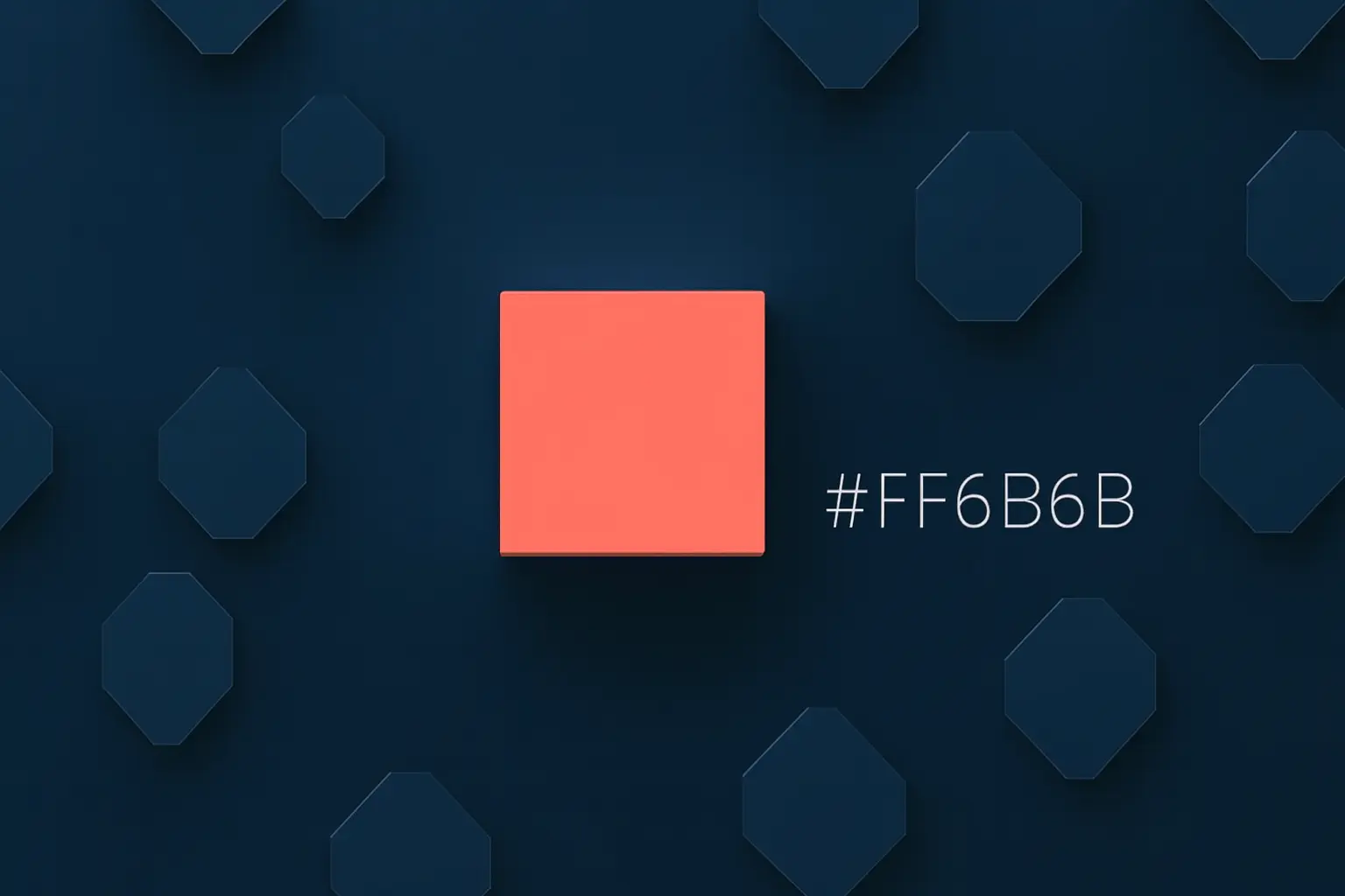
  • Very light backgrounds for calm in the layout (e.g. #FFF5F5, #F9FAFB).
  • Dark navy for strong contrast on buttons (e.g. #0F172A for text or headers).
  • Soft beige/cream for warm, inviting branding (e.g. #FAF3E0).
  • Subtle accents in a muted yellow for highlights (e.g. #FFD166).
Copy hex code:
#FF6B6B
#FFF5F5
#0F172A
#FAF3E0
#FFD166

#E76F51 – Terracotta for warm brand appearances

Terracotta color scheme in web design as an alternative to red (#E76F51)
Terracotta (#E76F51) creates a natural, warm brand effect.
Effect: natural, warm, down-to-earth Ideal for: Lifestyle brands, interior & architecture, cafés, sustainable products #E76F51 is an earthy terracotta shade that has a much softer effect than bright red. It conveys warmth and naturalness – perfect for brands that want to appear personal, high-quality and tangible. Terracotta cuts a very modern figure on websites, especially in combination with plenty of white space and fine serif or sans-serif fonts. The color is ideal for headlines, accent areas or image overlays. BSC tip: Use #E76F51 as the primary color in your branding and combine it with neutral shades of grey. This gives your site a high-quality and modern look without being too colorful. Combination tips:
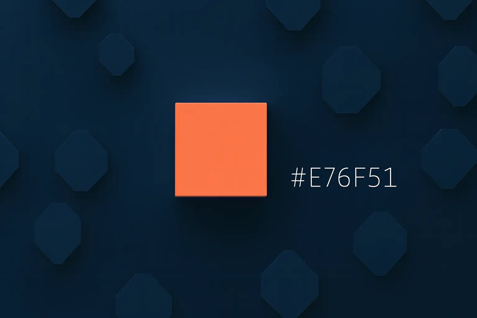
  • Soft orange as a transition color for buttons or badges (e.g. #F4A261).
  • Deep petrol as contrast for navigation or footer (currently #264653).
  • Cream white for backgrounds and content boxes (e.g. #FAF3E0).
  • Dark gray/black for easily legible continuous text (e.g. #1C1C1E).
Copy hex code:
#E76F51
#F4A261
#264653
#FAF3E0
#1C1C1E

#F97316 – Modern orange for energy & dynamism

UI design with modern orange as an alternative to red (#F97316)
Modern orange (#F97316) provides energy in buttons and highlights.
Effect: lively, energetic, motivating Ideal for: Start-ups, digital products, sports & fitness offers, SaaS websites #F97316 is a modern, strong orange that immediately brings energy to the layout. Compared to red, it appears more optimistic and less “bug color”, but remains a strong eye-catcher. The color tone works particularly well for call-to-action elements, illustrations and icons in hero sections. In combination with dark blue or gray tones, it creates a professional, techy look. BSC tip: Use #F97316 for your most important call to action – but only there. If everything is orange, the color loses its effect. A few, targeted accents work better. Combination tips:
  • Deep dark blue or anthracite for header and footer (e.g. #0F172A).
  • Very light areas for content (e.g. #F9FAFB, #FFFFFF).
  • Bright orange as hover or background color (e.g. #FED7AA).
  • A subtle yellow as a secondary accent (e.g. #FACC15).
Copy hex code:
#F97316
#0F172A
#F9FAFB
#FED7AA
#FACC15

#DB2777 – Berry pink for bold brands

Berry pink as a modern red alternative in web design (#DB2777)
Berry pink (#DB2777) sets strong, emotional accents.
Effect: modern, expressive, emotional Ideal for: Fashion, beauty, personal brands, events & creative industries #DB2777 is a strong berry shade between pink and magenta. It looks confident and emotional – perfect for brands that want to stand out without relying on classic red. The color tone creates strong contrasts on light backgrounds. In combination with plenty of white space and clear typography, it creates a high-quality, almost editorial look that works particularly well on landing pages, portfolios and store pages. BSC tip: Use #DB2777 deliberately for highlights: Headings, key words, buttons or graphic elements. Combined with subtle grey, the design remains serious despite the eye-catching color. Combination tips:
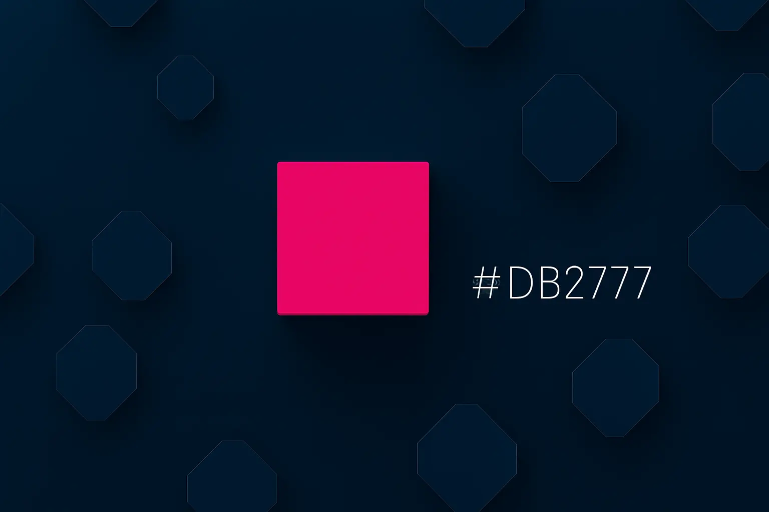
  • Light pink for soft backgrounds (e.g. #F9A8D4).
  • Dark anthracite or almost black for texts (e.g. #111827).
  • Soft yellow or cream as a contrasting color (e.g. #FDE68A).
  • Nearly white background for maximum clarity (e.g. #F9FAFB).
Copy hex code:
#DB2777
#F9A8D4
#111827
#FDE68A
#F9FAFB

#7C3AED – Digital violet as a bold red alternative

Digital violet in interface design as an alternative to red (#7C3AED)
Digital violet (#7C3AED) looks creative and innovative in UI design.
Effect: modern, creative, digital Ideal for: Tech start-ups, agencies, SaaS products, creative services #7C3AED is a strong, digital violet that is ideal as an alternative to classic signal or brand red tones. The color looks innovative and creative and clearly stands out from typical standard palettes. In UI designs, violet can be used very well for buttons, accent areas or background gradients. Combined with cool, neutral shades of gray or a light blue, it creates a modern, slightly futuristic style. BSC tip: Use #7C3AED sparingly but selectively – for CTA buttons, links or key visuals, for example. For continuous text and large areas, you should switch to neutral tones so that the design does not become too “loud”. Combination tips:
  • Very light lavender tones for backgrounds (e.g. #EEF2FF).
  • Dark slate gray for navigation and typography (e.g. #1E293B).
  • Accent in cyan or light blue for a modern, digital look (e.g. #38BDF8).
  • Almost white for content areas (e.g. #F9FAFB).
Copy hex code:
#7C3AED
#EEF2FF
#1E293B
#38BDF8
#F9FAFB

Conclusion: The 5 best alternatives to red (#FF0000)

Instead of hard pure red, in 2025 you can opt for modern, differentiated tones that better suit your brand and your target group:
  • #FF6B6B – Coral Red: friendly, ideal for CTAs and accents.
  • #E76F51 – Terracotta: warm, natural, perfect for brands with a “human touch”.
  • #F97316 – Modern orange: full of energy, strong for start-ups and dynamic offerings.
  • #DB2777 – Berry pink: emotional, bold, ideal for fashion, beauty & personal brands.
  • #7C3AED – Digital purple: creative, innovative, perfect for tech & agencies.
Read more: If you want to plan your color scheme holistically, our Color Scheme Guide for Websites 2025 and the article “Website Colors & Psychology: Meaning 2025” will help you.
If you want to rebuild or revise your website in general, you will find the following in the guide “Create Website 2025 – Step-by-Step” a complete guide from planning to publication.

FAQ: Alternatives to red in web design

When should I still use classic red (#FF0000)?Pure red is still well suited for warnings, error messages or very urgent information – i.e. wherever danger or a stop needs to be signaled. Softer alternatives are usually the better choice for branding, buttons and general accents.
Which alternative to red is best for call-to-action buttons? #FF6B6B (Coral Red) and #F97316 (Orange) are ideal for CTAs. Both colors stand out, but are friendlier than pure red and are often perceived more positively by users.
How do I find out which color matches my brand?Think about which characteristics your brand should convey: warm and human, technical and modern, playful or serious. Combine these considerations with the described effects of the colors and test different variants in the design or with A/B tests.
Do I have to change my entire design if I replace red?No. It is often enough to swap the primary or accent color and adjust buttons, links, icons and highlights step by step. This way, your brand remains recognizable, but looks more modern and coherent.

In this article

Porträt von Tobias Berger, junger Mann mit lockigen Haaren und blauem BSC-Pulli, lächelnd in die Kamera blickend.

Hey, I'm Tobias!

Thanks for taking the time to read this post – really cool that you’re interested in website & web design! 
You can find many more tips on design, technology and SEO on our blog. And if you have any questions or need support with your own website, we at BSC Webdesign are always happy to help.