5 modern alternatives to black in web design [2025] + tips for color combinations

by Tobias Berger / updated 18.09.2025 / 6 min. reading time
by Tobias Berger / updated 18.09.2025 /
6 min. reading time
Not all black is the same – especially not in modern web design.
If you rely on pure #000000, you risk a design that looks cheap, garish or difficult to read. Especially in dark mode, black can be too harsh, tiring the eyes and pushing content into the background.
The good news: there are modern alternatives to black that create depth, elegance and a premium feel. In this article, we show you 5 shades of “almost black” that are perfect for dark fashion websites – including tips on color combinations.
Tip: If you prefer a bright, minimalist design instead, read our article 🔗 5 modern alternatives to pure white (#FFFFFF) for modern, pleasant and professional layouts.#121212 - Dark mode standard for modern websites
1. montserrat - modern & versatile
Ideal for: Websites, navigation, buttons, headlines
Effect: friendly, clean, modern
Colors: #1E1E1E (dark gray) + #FFFFFF (white) + #4CAFEB (blue) The dark gray brings stability, white provides clarity, blue sets a fresh accent
Vorteile von #121212
- Wirkt weniger grell als reines Schwarz (#000000).
- Schont die Augen in dunkler Umgebung.
- Sorgt für eleganten Kontrast ohne harte Übergänge.
- Auf OLED-Displays besonders hochwertig und tief.
Kombinationstipps
- Helle Grautöne für Lesbarkeit:
#E0E0E0#F5F5F5
- Akzentfarben dezent einsetzen:
#00ADB5#FF6F61
- Weiße Flächen gezielt als Highlights nutzen.
- Leichte Glassmorphism- oder Neumorphism-Effekte für zusätzliche Tiefe.
Benefits of #121212
- Feels less harsh than pure black (#000000).
- Gentler on the eyes in low-light environments.
- Delivers elegant contrast without hard edges.
- Looks premium on OLED displays with deep blacks.
Pairing Tips
- Use soft grays for readability:
#E0E0E0#F5F5F5
- Add subtle accent colors:
#00ADB5#FF6F61
- Reserve white space for highlights.
- Apply gentle glassmorphism or neumorphism for depth.
#0D0D0D - The underdog for deep dark fashion designs
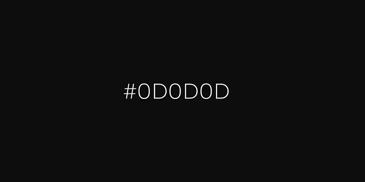
#0D0D0D is almost black, but softer. It avoids the “hole effect”. Shadows, glow and glass morphism work very well on it. Legibility remains stable. Ideal for overlays, footers, modals and hero slides.
Vorteile von #0D0D0D
- Wirkt fast schwarz, aber weicher und angenehmer.
- Vermeidet den „Loch-Effekt“ reinen Schwarztons.
- Perfekt für Footer, Overlays oder Hero-Sections.
Kombinationstipps
- Feine Linien in Hellgrau:
#DADADA
- Serifenschriften für einen edlen Editorial-Look.
- Goldtöne für ein luxuriöses Finish:
#C9B37E
- Großzügiger Whitespace für Balance.
Benefits of #0D0D0D
- Appears nearly black but softer and more elegant.
- Avoids the “hole effect” of pure black.
- Perfect for footers, overlays or hero sections.
Pairing Tips
- Use fine lines in light gray:
#DADADA
- Choose serif fonts for an editorial look.
- Add gold tones for a luxurious finish:
#C9B37E
- Generous whitespace for balance.
#222222 - Versatile dark gray for interfaces & SaaS websites
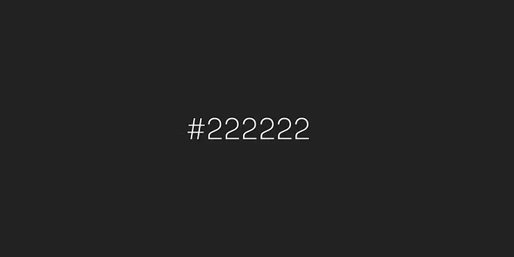
#222222 is a calm, neutral dark gray. It organizes dashboards and SaaS interfaces without dominating. Texts and elements have a clear contrast. It looks professional and calm. Perfect for cards, navbars, forms and developer portfolios.
Vorteile von #222222
- Klare Lesbarkeit mit Weiß oder Grau (#FAFAFA, #CCCCCC).
- Sorgt für Struktur bei UI-Elementen.
- Wirkt ruhiger und weniger hart als Schwarz.
Kombinationstipps
- Akzentfarben wie Limonengrün für Frische:
#C0FF00
- Elektroblau für einen Tech-Look:
#3385FF
- Soft Orange für Wärme:
#FFAA66
Benefits of #222222
- Clear readability with white or gray (#FAFAFA, #CCCCCC).
- Provides structure for UI elements.
- Feels calmer and less harsh than pure black.
Pairing Tips
- Accent color Lime Green for freshness:
#C0FF00
- Electric Blue for a tech look:
#3385FF
- Soft Orange for warmth:
#FFAA66
In this article
#181818 - Netflix gray for storytelling & content websites

#181818 is the well-known “Netflix gray”. Images, thumbnails and CTAs shine more brightly on it. The look is cinematic and modern. It is less harsh than pure black. Great for landing pages, videos and hero sections.
Vorteile im Webdesign
- Ideal für Video-Content & Cinematics.
- Macht CTAs leuchtender:
#E50914
- Wirkt menschlicher als reines Schwarz (#000000).
Kombinationstipps
- Kräftige Akzente in Rot, Türkis oder Elektroblau.
- Hero-Sektionen mit Bewegtbild.
- Moderne, runde Schriften.
Benefits in Web Design
- Ideal for video content & cinematics.
- Makes CTAs pop:
#E50914
- Feels more human than pure black (#000000).
Pairing Tips
- Bold accents in red, teal, or electric blue.
- Hero sections with motion video.
- Modern, rounded typefaces.
#1C1C1E - Minimalist black alternative for premium web design

#1C1C1E has a minimalist and elegant look. Lots of whitespace and clear typography come into their own here. The contrast is pleasant and not too harsh. Content remains the focus. Ideal for portfolios, editorial layouts and luxury websites.
Vorteile von #1C1C1E
- Wirkt elegant mit Weiß (#FFFFFF) oder Elfenbein (#FDFDFD).
- Passt zu Portfolios, Editorial-Layouts & High-Fashion-Websites.
- Sorgt für visuelle Ruhe und minimalistisches Design.
Kombinationstipps
- Feine Linien in Hellgrau:
#DADADA
- Serifenschriften für ein Editorial-Feeling.
- Goldtöne für ein luxuriöses Finish:
#C9B37E
- Großzügiger Whitespace.
Benefits of #1C1C1E
- Pairs elegantly with white (#FFFFFF) or ivory (#FDFDFD).
- Perfect for portfolios, editorial layouts & high-fashion websites.
- Creates visual calm and a minimalist design.
Pairing Tips
- Use fine lines in light gray:
#DADADA
- Choose serif typefaces for an editorial look.
- Add gold tones for a luxurious finish:
#C9B37E
- Generous whitespace for a clean layout.
Summary: The best alternatives to black in web design [2025]
Vorteile von #1C1C1E
- Wirkt elegant mit Weiß (#FFFFFF) oder Elfenbein (#FDFDFD).
- Passt zu Portfolios, Editorial-Layouts & High-Fashion-Websites.
- Sorgt für visuelle Ruhe und minimalistisches Design.
Kombinationstipps
- Feine Linien in Hellgrau:
#DADADA
- Serifenschriften für ein Editorial-Feeling.
- Goldtöne für ein luxuriöses Finish:
#C9B37E
- Großzügiger Whitespace.
Benefits of #1C1C1E
- Pairs elegantly with white (#FFFFFF) or ivory (#FDFDFD).
- Perfect for portfolios, editorial layouts & high-fashion websites.
- Creates visual calm and a minimalist design.
Pairing Tips
- Use fine lines in light gray:
#DADADA
- Choose serif typefaces for an editorial look.
- Add gold tones for a luxurious finish:
#C9B37E
- Generous whitespace for a clean layout.
Black doesn’t always have to be #000000. Especially in dark mode, shades of “almost black” look more elegant, easier on the eyes and more modern. Here are the five most important alternatives – including typical areas of application:
-
#121212 – Dark mode standard, perfect for interfaces & apps.
-
#1C1C1E – Minimalist & classy, ideal for portfolios & luxury brands.
-
#181818 – Netflix gray, strong stage for storytelling & videos.
-
#0D0D0D – Mystical & deep, great for footers, overlays & hero sections.
-
#222222 – All-rounder, suitable for B2B, SaaS & functional interfaces.

Hey, I'm Tobias!
Thanks for taking the time to read this post – really cool that you’re interested in website & web design!
You can find many more tips on design, technology and SEO on our blog. And if you have any questions or need support with your own website, we at BSC Webdesign are always happy to help.