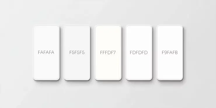
5 modern alternatives to pure white (#FFFFFF) [2025]

by Tobias Berger / updated 23.09.2025 / 7 min. reading time
by Tobias Berger / updated 24.09.2025 /
7 min. reading time
Many people automatically choose #FFFFFF for the background color of their website – i.e. pure white. But what sounds “neutral” and “clean” often appears too garish, sterile and straining for the eyes on screens.
This is why modern web designers are increasingly relying on off-white tones – off-white tones that have a more pleasant, high-quality and versatile effect.
Tip: If you prefer a dark design or dark mode instead, read our article 🔗 5 modern alternatives to black in web design for elegant, eye-friendly layouts.
Here are 5 modern alternatives to #FFFFFF that you should know for your next project – incl. hex code, effect, color combinations and application tips.
#FAFAFA - the modern classic for clean websites

Effect: Neutral, soft, minimalist
Ideal for: Tech websites, portfolios, agencies
This light gray off-white shade is almost indistinguishable from classic white – and that is precisely what makes it so valuable. #FAFAFA takes the harshness out of the layout that real pure white can create and gives your website a subtle, modern finish.
It is the perfect solution for anyone who wants a clean design without it appearing sterile or garish. This shade shows its strengths particularly in combination with minimalist fonts, icons or pastel shades. It ensures less visual exhaustion and at the same time looks stylishly restrained.
BSC tip:
Use the color for backgrounds of text areas, form sections or as a surface behind testimonials. Also ideal for cards or grid layouts where white would be too dominant.
Combination tips:
Light gray for fine lines (e.g. #DADADA, #E0E0E0)
Pastel shades for soft accents (e.g. #FADADD, #D9F6F5)
Black icons for strong contrast (e.g. #121212)
Dark sans-serif fonts for minimalism (e.g. #1C1C1E)
#F5F5F5 - the smart light gray for blogs & stores

Effect: Calm, reserved, serious
Ideal for: Blogs, stores, information sites
Slightly darker and more defined than #FAFAFA, but still clearly off-white – #F5F5F5 is the color for anyone who values structure and legibility. The slightly higher density makes the background appear calmer and more grounded, which is particularly important for content-heavy sites such as blogs or stores.
It supports the popular magazine look – a layout with lots of white space, clear typography and targeted color accents. On brighter screens, the color tone is often more pleasant for longer reading than pure white.
BSC tip:
Use #F5F5F5 as a base for articles, FAQ areas or product descriptions. Also perfect as a gentle divider between sections, without visible lines.
Combination tips:
Dark gray for headlines and texts (e.g. #333333, #2B2B2B)
CTA blue & accent red for buttons (e.g. #3B82F6, #E63946)
Amber/orange for highlights (e.g. #F59E0B)
Subtle beige for warmth (e.g. #F5EDE1)
#FFFDF7 - the warm white for confident designs

Effect: Inviting, friendly, slightly warm
Ideal for: Health sites, creative brands, coaching
#FFFDF7 has a slight yellow component and therefore appears warmer than other shades of white. This shade immediately creates a positive, trusting atmosphere – perfect for websites where the first impression should convey empathy and humanity.
Particularly suitable for designs that do not want to appear sterile or distant, e.g. for coaches, in the healthcare sector or for handmade products. The result is a harmonious, organic overall look.
BSC tip:
Ideal for “about us” pages, testimonials or emotional imagery. Very nice in combination with warm tones and natural textures.
Combination tips:
Beige for smooth transitions (e.g. #EDE7DC, #F1EADF)
Olive green for natural accents (e.g. #8B9B77, #A1B09A)
Blush/rosé for emotional highlights (e.g. #E3A5A1)
Terracotta for warm depth (e.g. #C57B57)
In this article
#FDFDFD - the subtle soft white for high-end looks

Effect: Clean, elegant, barely distinguishable from white
Ideal for: Design portfolios, brand appearances, modern companies
#FDFDFD is ideal for anyone who loves the clean look of white but wants to add subtle sophistication. Almost identical to #FFFFFF at first glance, this shade makes a noticeable difference in practice – especially in high-quality, minimalist layouts.
It minimally but effectively reduces the hardness of pure white. This maintains clarity without the screen dazzling. The result is a high-quality overall impression for sophisticated designs.
BSC tip:
Use #FDFDFD for hero sections, large white areas or portfolio galleries. In combination with lots of air and soft shadows, this creates a feeling of exclusivity.
Combination tips:
Gold for luxurious details (e.g. #C9B37E, #D4AF37)
Light gray for fine lines (e.g. #E0E0E0, #D6D6D6)
Black for strong typography (e.g. #121212)
Cool neutral for surfaces (e.g. #F5F5F5)
#F9FAFB - the UI favorite white for digital products

Effect: Techy, UI-friendly, modern
Ideal for: Startups, SaaS products, landing pages
#F9FAFB is the favorite of many UI designers. It looks almost like white, but has a slightly cool, structuring note that provides clarity, especially in digital products. In contrast to real white, it appears less garish and supports a clear visual hierarchy.
This color is often used in UI kits as a standard for sections, cards or entire page layouts. This allows content to be clearly separated from one another without the need for visible lines.
BSC tip:
Perfect for dashboards, forms or pricing sections. Particularly strong in combination with modern color accents and shadow effects.
Combination tips:
Blue for call-to-actions (e.g. #3B82F6, #2563EB)
Mint/teal for modern accents (e.g. #10B981, #34D399)
Light gray for neutral surfaces (e.g. #E5E7EB, #D1D5DB)
Dark gray for strong typography (e.g. #111827, #1F2937)
Summary: Off-white is the new white
White doesn’t always have to be #FFFFFF. On modern websites in particular, off-white nuances have a more pleasant, high-quality and user-friendly effect. Here are the five best alternatives – including typical areas of application:
#FAFAFA – Modern classic, ideal for minimalist layouts and clean designs.
#F5F5F5 – Smart tone for blogs, stores and content-heavy websites.
#FFFDF7 – Warm and friendly, perfect for coaching, health and handmade products.
#FDFDFD – Subtle and classy, ideal for high-end brands and premium portfolios.
#F9FAFB – Modern UI favorite for SaaS, dashboards and web apps.
Which color is best as a background color in web design?
The optimal background color depends on the design and the brand.
Off-white tones such as #FAFAFA, #F5F5F5 or #F9FAFB are easier on the eyes and look more modern than pure white (#FFFFFF).
Why shouldn't I use #FFFFFF as the background color?
Pure white can appear very bright and tiring on screens.
Off-white colors appear softer, of higher quality and create a pleasant reading experience – especially when used for longer periods or in dark mode.
What is the difference between white and off-white?
White (#FFFFFF) is the purest shade without nuances.
Off-White contains light shades of gray, beige or yellow, which make the background appear warmer or cooler and therefore more modern and professional.
Which off-white colors will be trending in web design in 2025?
Popular trend colors 2025 are:
#FAFAFA for minimalist layouts
#F5F5F5 for blogs and stores
#FFFDF7 for warm, human designs
#FDFDFD for premium brands
#F9FAFB for SaaS products and UI design
How do I find the right background color for my branding?
Think about what emotions you want your website to convey:
Warm & inviting → Beige & warm off-whites (#FFFDF7)
Minimalist & modern → cool off-whites (#FAFAFA, #F5F5F5)
Technical & functional → UI colors (#F9FAFB)
It is best to test the colors directly in a mockup or prototype to see the effect live.

Hey, I'm Tobias!
Thanks for taking the time to read this post – really cool that you’re interested in website & web design!
You can find many more tips on design, technology and SEO on our blog. And if you have any questions or need support with your own website, we at BSC Webdesign are always happy to help.